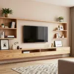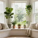
Creating a mood in your kitchen is more than just choosing the right appliances or layout. It’s about the colors that surround you. If you’ve been feeling the itch to refresh your kitchen or simply want to explore the impact of different shades, you’re in the right place. There’s something magical about how color can transform a space, influencing your emotions, your appetite, and even your creativity while cooking. That’s why I’ve put together this list of kitchen interior color ideas that can help set the perfect vibe for your home.
This post is made for anyone looking to revitalize their kitchen area. Whether you’re a homeowner, a renter, or someone dreaming of a kitchen makeover, understanding color psychology in kitchens can guide your choices. You might be drawn to warm kitchen tones for a cozy atmosphere, or perhaps you prefer sleek, modern kitchen decor with bold accents. No matter your style, I’ve gathered 14 distinct color ideas that not only look great but also evoke specific feelings. Get ready to discover how a splash of color can turn your kitchen into a vibrant heart of your home!
With these kitchen color schemes, you will gain insights into how each hue can affect the mood of your space. From soft sage greens that bring calmness to bold charcoals that exude elegance, there is something here for everyone. You’ll find practical kitchen paint ideas that are easy to implement and can dramatically alter the atmosphere. Let’s dive in and explore these colors that are sure to inspire your next renovation!
Key Takeaways
– Color greatly affects mood, making it essential to choose the right shades for your kitchen space.
– Kitchen interior color ideas range from serene pastels to bold, dramatic hues, catering to various styles and preferences.
– Each color evokes different feelings; for example, warm terracotta can create an inviting atmosphere, while crisp white symbolizes cleanliness and order.
– Modern kitchen decor can blend functionality with style by incorporating trendy color schemes that enhance visual appeal.
– Practical kitchen paint ideas can serve as a guide to help you choose colors that not only look good but also contribute to a positive cooking experience.
1. Soft Sage Green: A Breath of Fresh Air

The gentle tones of soft sage green breathe life into your kitchen, creating a serene atmosphere that feels both refreshing and timeless. This color works wonders by connecting to nature, inviting tranquility into your cooking space. Imagine sage green cabinetry paired with warm wood countertops, offering a harmonious balance that feels both organic and stylish. Adding touches of crisp white or cream enhances the visual appeal, creating a bright contrast that uplifts the overall aesthetic.
To make the most of this soothing palette, consider practical implementation tips. You can find budget-friendly alternatives like paint options or ready-to-assemble cabinets to achieve this look without breaking the bank. This color also aligns beautifully with broader design trends, evoking feelings of calmness and comfort as you prepare meals for your loved ones.
Consider these elements to maximize this palette’s potential:
– Pair sage-painted lower cabinets with open oak shelving
– Install butcher block countertops alongside painted islands
– Use walnut handles on green cabinet doors
This approach brings sophistication while maintaining approachability. Incorporating natural textures and materials enhances the overall aesthetic and creates a cohesive look throughout the space.
2. Bold Charcoal: Modern Elegance

A bold charcoal gray kitchen exudes modern elegance, making a striking statement without overwhelming the senses. This sophisticated hue adds depth and character, especially when paired with crisp white or metallic accents. Imagine charcoal cabinets set against light countertops, creating a chic contrast that feels both inviting and contemporary. This color is particularly suited for urban homes, where it can establish a refined atmosphere while still feeling approachable.
To implement this look, consider practical tips like incorporating wooden elements or warm lighting. These touches can soften the starkness of charcoal, ensuring your kitchen feels cozy and welcoming. With the right choices, you can embrace current design trends while creating a space that feels sophisticated yet lived-in.
Consider these elements to elevate your charcoal kitchen:
– Accent with brass, copper, or vibrant yellows
– Install glossy tiles or a sleek glass backsplash
– Use warm LED lights to create a cozy atmosphere
When done right, charcoal can transform your kitchen into a stylish haven that’s perfect for both cooking and entertaining.
Key Trade-offs & Our Top Pick
Option Comparison
Soft Sage Green
– Pros:
– Creates a calming atmosphere, perfect for cooking and gathering.
– Pairs well with natural wood accents, enhancing a serene vibe.
– Cons:
– Might appear too muted in dim lighting.
– Can clash with certain appliances or decor styles.
– Best for: Small kitchens aiming for a spacious feel.
Bold Charcoal
– Pros:
– Offers a modern, sophisticated look that’s easy to style.
– Hides stains and wear better than lighter colors.
– Cons:
– Can make a small kitchen feel more closed off.
– Requires good lighting to avoid a gloomy atmosphere.
– Best for: Larger kitchens wanting a dramatic flair.
Crisp White
– Pros:
– Timeless and versatile, matching any cabinet or countertop.
– Reflects light, making spaces feel bigger and brighter.
– Cons:
– Shows dirt and fingerprints easily, needing frequent cleaning.
– May feel sterile without colorful accents.
– Best for: Open-concept layouts and those wanting a clean slate.
Warm Terracotta
– Pros:
– Adds warmth and an earthy feel, perfect for cozy homes.
– Pairs well with rustic and modern design elements.
– Cons:
– May not blend well with cooler color palettes.
– Can make a space feel smaller if overused.
– Best for: Homes with a warm, inviting kitchen atmosphere.
Elegant Beige
– Pros:
– Neutral and warm, it complements various design themes.
– Offers a subtle backdrop for colorful décor.
– Cons:
– Can appear dull if paired poorly with other shades.
– Might blend too much with certain finishes, losing personality.
– Best for: Classic kitchen designs and easy color mixing.
Expert Recommendation:
Best Overall: Crisp White
Crisp White stands out as the best overall choice. It provides excellent value for money by creating an inviting and spacious feel while being easy to maintain with the right accents. Its versatility allows you to mix and match with other colors and styles, ensuring your kitchen can evolve with trends. Plus, its long-term durability keeps it looking fresh for years to come.
Why We Picked This:
While Crisp White is a great choice for many, others might lean towards Soft Sage Green for a calming effect or Bold Charcoal for boldness. If you’re after warmth, then Warm Terracotta could be more appealing. Each option has unique traits, so consider your kitchen’s layout, lighting, and personal style when making your pick!
3. Crisp White: The Timeless Classic

Opting for a crisp white kitchen never goes out of style! This bright hue creates an airy feel and evokes cleanliness, making your space feel larger and more inviting. White allows you to experiment with various textures and accents, from colorful dishware to vibrant fruits that pop against a neutral backdrop. Consider mixing materials like wood and metal to add dimension and interest to the overall design.
For a practical approach, explore options like matte versus glossy finishes to create visual depth. Incorporating colorful accessories can breathe life into the space, making it feel dynamic and welcoming. Natural light plays a crucial role; keeping windows unobstructed allows sunlight to enhance the bright ambiance of your kitchen.
Consider these tips for a timeless white kitchen:
– Experiment with matte versus glossy finishes for cabinets
– Use colorful dishware or decorative plants to bring life
– Ensure ample natural light for an open feel
A crisp white kitchen is not just a safe bet; it’s versatile and timeless, fitting seamlessly into any home design.
Crisp White: The Timeless Classic
Editor’s Choice


4. Soft Blue: Calm and Collected

Soft blue kitchens radiate a peaceful ambiance, perfect for creating a nurturing cooking environment. This lovely hue evokes the serenity of clear skies and tranquil waters, promoting relaxation as you whip up your favorite recipes. Pair soft blue accents with white or gray to achieve a balanced look that feels inviting and fresh. This color works beautifully with a variety of decor styles, from coastal to modern minimalism.
To incorporate this soothing color, think about using it for cabinetry or as an accent wall. You can also enhance the look by introducing various textures, such as shiplap walls or rustic shelving. This color brings emotional benefits by creating a serene backdrop that enhances your cooking experience.
Consider these tips to infuse soft blue into your kitchen:
– Use soft blue tones in cabinets or as an accent wall
– Incorporate white ceramics or vintage items for added charm
– Add textured elements like shiplap or rustic shelves
With soft blue, you can easily create a serene backdrop that makes your kitchen feel like a retreat.
“Soft blue walls channel calm vibes even on busy mornings. When I cook, I crave that serene backdrop—white countertops, gray accents, and that gentle blue whisper that keeps you grounded. It’s practical: easy to pair with decor and it never feels loud.”
Soft Blue: Calm and Collected
Editor’s Choice


5. Warm Terracotta: Earthy and Inviting

Terracotta introduces warmth and earthiness into your kitchen, creating a cozy and inviting atmosphere. This rich shade pairs beautifully with natural materials like wood and stone, striking a perfect balance between rustic charm and modern design. Imagine terracotta tiles underfoot or as a vibrant backsplash, complemented by wooden cabinets for an inviting space ideal for family gatherings.
To bring this look to life, consider cost-effective options like terracotta-inspired vinyl tiles or painted accents. Warm lighting can also enhance the richness of terracotta, making your kitchen feel even more welcoming. This color aligns with current design trends that prioritize comfort and connection to nature.
Consider these ideas to embrace terracotta in your kitchen:
– Use terracotta tiles for flooring or backsplashes
– Incorporate deep greens, creamy whites, or warm beiges
– Add handmade ceramics for character and charm
With terracotta, you’ll create a welcoming atmosphere that makes cooking and family meals feel special.
6. Gentle Coral: A Touch of Playfulness

Gentle coral is a delightful choice if you want a kitchen color that feels warm yet cheerful. This lovely hue injects vibrancy and playfulness into the space without overwhelming it. Consider using coral on an accent wall or as a highlight color in your cabinetry to bring a fresh touch. It beautifully complements neutral whites or grays, making it versatile for various styles, from contemporary to bohemian.
To make the most of coral’s playful nature, think about incorporating it in open-plan kitchens or cozy nooks. You can also accessorize with coral-colored dish towels or storage containers to tie the theme together seamlessly. This color creates an uplifting mood, making your kitchen an enjoyable space for cooking and entertaining.
Consider these tips to bring coral into your kitchen:
– Use coral on an accent wall or in cabinetry
– Pair with soft aqua or muted greens for balance
– Incorporate coral accessories to enhance the theme
Gentle coral can truly uplift the mood of your kitchen, making it a fun space for cooking and entertaining.
Gentle Coral: A Touch of Playfulness
Editor’s Choice


7. Elegant Beige: Natural and Neutral

Beige is a classic choice that exudes warmth and sophistication without feeling heavy. This neutral color serves as a perfect backdrop for a modern minimalist kitchen, allowing textures and materials to shine. Beige pairs seamlessly with whites, browns, and various accent colors, making it incredibly versatile. Consider using beige with matte finishes for cabinetry or walls to create a serene, cohesive look.
To elevate this neutral palette, explore textural variations like matte versus glossy finishes. Introducing earth-toned accessories can enhance the warmth of beige, ensuring your kitchen feels inviting. Warm lighting is crucial; it can transform beige into a cozy haven, perfect for family gatherings.
Consider these strategies to incorporate beige into your kitchen:
– Explore matte versus glossy finishes for cabinets
– Use earth-toned accessories for added warmth
– Opt for warm lighting to elevate the beige tones
With beige, you can create an elegant kitchen that feels calm and inviting, perfect for both cooking and entertaining.
Elegant Beige: Natural and Neutral
Editor’s Choice


8. Vibrant Mustard: A Bold Statement

If you’re aiming to make a bold statement, vibrant mustard is an exciting choice for your kitchen. This lively shade can energize the space, creating a warm and inviting atmosphere. Pair mustard with darker tones like navy or charcoal for a modern twist, or keep it light with whites and creams for a fresh feel. It’s perfect for accent walls, cabinetry, or even accessories like bar stools or lighting fixtures.
To highlight mustard’s potential, consider using it in retro-style accessories that complement the bold color. You can also explore warm lighting options to keep the space feeling cozy and inviting, ensuring that mustard remains a joyful highlight rather than overwhelming.
Consider these tips to incorporate mustard into your kitchen:
– Use mustard for accent walls or cabinetry
– Pair with deep navy, charcoal gray, or crisp white
– Opt for warm lighting to soften the bold color
Mustard can be the perfect pop of color in a mostly neutral kitchen, ensuring that it feels both lively and inviting.
Vibrant Mustard: A Bold Statement
Editor’s Choice


9. Deep Forest Green: Nature’s Touch

Deep forest green brings a rich, organic vibe to your kitchen, creating a grounded and nurturing environment. This color works beautifully with natural materials and tones, making it ideal for those who love rustic or nature-inspired decor. Picture deep green cabinets or an accent wall paired with wood, stone, or white accents for a balanced look. This hue evokes feelings of calm and connection to nature, essential for a space where meals are prepared.
To embrace this color, consider incorporating natural woods or metallic accents that complement the richness of forest green. Adding plants can provide an extra touch of freshness, while soft lighting enhances the depth of this hue, making your kitchen feel even more inviting.
Consider these elements to incorporate deep forest green:
– Use deep green for cabinetry or as an accent wall
– Pair with natural woods, cream, or brass accents
– Incorporate plants to enhance freshness
A deep forest green kitchen can provide a serene retreat, making your culinary adventures all the more enjoyable.
10. Dusty Rose: Soft and Romantic

Dusty rose is a subtle yet chic color that adds romance to your kitchen. This soft, muted pink evokes warmth and comfort, creating a cozy home environment. Use dusty rose on cabinets, walls, or simply in accessories to introduce a hint of color without overwhelming the space. Pair it with whites, soft grays, and golds to create an elegant palette that feels inviting.
To enhance the romantic feel, consider incorporating vintage or rustic elements that complement dusty rose beautifully. You can also mix smooth surfaces with textured accents for added visual interest, creating a dynamic and inviting atmosphere.
Consider these strategies to bring dusty rose into your kitchen:
– Use dusty rose for cabinets or as an accent color
– Pair with whites, soft grays, or muted greens
– Mix smooth surfaces with textured elements for depth
With dusty rose, your kitchen becomes a warm and inviting space, ideal for intimate family gatherings or cozy dinners.
11. Classic Navy: Timeless and Sophisticated

Navy blue is a timeless choice that adds depth and sophistication to any kitchen. When paired with white, it creates a classic nautical feel that is both refreshing and elegant. Use navy for cabinetry or as an accent wall, and accessorize with brass or gold for a touch of luxury. This rich color evokes calmness and stability, making it a fantastic choice for the heart of your home.
To enhance this look, consider using warm, soft lighting that complements the deep navy tones. White tiles or marble accents can provide a chic contrast, ensuring your kitchen feels modern and sophisticated. This combination is perfect for creating a space that feels both stylish and welcoming.
Consider these tips to incorporate navy into your kitchen:
– Use navy for cabinetry or as an accent wall
– Accessorize with brass, white, or natural wood
– Opt for warm lighting to enhance the deep color
With classic navy, you can create a kitchen that feels both modern and timeless, perfect for any decor style.
Classic navy walls make mornings feel calmer and evenings feel more refined. In kitchen interior color ideas, pairing navy with warm lighting and brass accents turns everyday meals into a timeless, sophisticated ritual you’ll actually enjoy.
12. Light Gray: Understated and Chic

Light gray is a versatile and chic color that works well in any kitchen setting. This hue can make your space feel larger and airier while adding a touch of modern elegance. Light gray pairs beautifully with whites and darker accents, creating a balanced and sophisticated look. Use it for cabinetry, walls, or as an accent color to keep the space feeling fresh and contemporary.
To enhance this look, explore complementary colors like charcoal and soft pastels to create depth. You can also experiment with matte versus gloss finishes for added texture, ensuring your kitchen feels dynamic yet serene. Proper lighting can elevate light gray tones, making the space feel bright and inviting.
Consider these elements to bring light gray into your kitchen:
– Pair light gray with white, charcoal, and soft pastels
– Explore matte versus gloss finishes for depth
– Use bright lights to enhance the light gray tones
The beauty of light gray lies in its adaptability, making it an ideal neutral backdrop for any kitchen style.
13. Bright Turquoise: Fun and Energetic

Bright turquoise can be a fun and energetic choice for your kitchen, reflecting creativity and liveliness. This vibrant shade works well in accent pieces or can be used boldly for cabinets and walls, making a lively statement. Pair turquoise with crisp whites or soft grays to help it pop and create a joyful atmosphere. This color radiates happiness and can energize your cooking space, perfect for those who enjoy a bit of flair in their home.
To highlight turquoise’s fun vibe, consider combining it with retro or eclectic decor styles that enhance its lively nature. Adding complementary colors like coral or gray can help balance the palette, ensuring that your kitchen feels bright and welcoming. Smooth finishes can enhance the bright vibe, making the space feel polished and stylish.
Consider these tips to incorporate bright turquoise:
– Use turquoise for bold cabinetry or accent features
– Pair with white, gray, or coral accents for balance
– Opt for smooth finishes to enhance the bright vibe
With bright turquoise, your kitchen becomes a vibrant gathering place for family and friends, full of energy and creativity.
14. Creamy Almond: Soft Luxury

Creamy almond is a soft, luxurious color that adds warmth and elegance to any kitchen. This subtle hue pairs beautifully with other neutrals, creating a welcoming atmosphere that’s both refined and cozy. Use creamy almond as a primary color for cabinets or walls, and complement it with natural wood tones and brushed metal fixtures for a polished finish. This color evokes feelings of comfort and relaxation, making it ideal for a cozy kitchen space.
To enhance this luxurious look, consider incorporating warm-toned wooden accessories that complement the creamy almond. You can also explore soft lighting options that highlight the richness of this hue, creating an inviting glow in your kitchen. This combination can transform your culinary space into a serene retreat for cooking and cherished family moments.
Consider these strategies to embrace creamy almond:
– Use creamy almond for cabinets or walls
– Incorporate warm-toned wooden accessories for warmth
– Opt for soft, warm lighting to enhance richness
With creamy almond, your kitchen can become a luxurious retreat, perfect for cooking and enjoying cherished family moments.
Creamy Almond isn’t just a color—it’s a mood you can live in. It warms up neutrals, making kitchen interior color ideas feel calm, inviting, and still polished. Try it on cabinets or walls for cozy, everyday luxury.
Conclusion

Choosing the right color for your kitchen can completely change the way you experience this important space in your home.
From calming greens to vibrant corals, these 14 kitchen interior color ideas offer something for everyone. Whether you prefer modern minimalism or a more rustic look, the perfect palette is waiting for you. Embrace the colors that inspire you, and let your kitchen reflect your personality and style.
Note: We aim to provide accurate product links, but some may occasionally expire or become unavailable. If this happens, please search directly on Amazon for the product or a suitable alternative.
This post contains Amazon affiliate links, meaning we may earn a small commission if you purchase through our links, at no extra cost to you.
Frequently Asked Questions
What are the best kitchen interior color ideas for a modern minimalist look?
Starting with a crisp, neutral base is key in kitchen interior color ideas for a modern minimalist look. Choose a base like off-white, light gray, or warm white and keep most surfaces in that calm tone. Then bring in one controlled accent color—think a soft sage, powder blue, or warm terracotta—on a focal element like the island, a tall pantry cabinet, or the backsplash. Use kitchen color schemes that balance light and warmth, and lean on natural materials and modern kitchen decor for texture. Action steps: test color swatches in daylight, limit your palette to 2–3 colors, and pick finishes (matte or satin) that reduce glare. Finally, use small decor pops—towels, jars, or a rug—in your kitchen paint ideas theme to tie the room together.
How can I use color psychology in kitchens to set the mood without making the space feel busy?
Color psychology in kitchens can set the mood without clutter. Calming hues like soft blues or sage greens can promote focus and calm, while warm neutrals create inviting, homey vibes. For busy families, pair cool wall colors with warm wood accents to balance energy. Action steps: decide the mood first, then pull three color options, test them under your kitchen lighting, and use kitchen paint ideas on walls that get the most light. Keep the rest of the space minimal to let the color breathe; this aligns with modern kitchen decor and kitchen color schemes that feel intentional.
Which warm kitchen tones work best in a minimalist kitchen, and how can I keep the look calm?
Warm kitchen tones that fit a minimalist vibe: cream, warm white, taupe, sand, and light wood tones. They add warmth without heaviness. Balance them with cool whites or pale grays on cabinets or countertops to preserve calm, uncluttered lines—this is the essence of modern kitchen decor. Practical tip: use warm tones on walls or paneling and keep cabinetry in a crisp white or light gray. Add texture with wood open shelving or a wooden butcher block. Finishes matter—go with matte or eggshell to keep reflections low and space feeling serene. Try updating with a kitchen paint ideas targeted to a single accent wall or the island.
How can color schemes help make a small kitchen feel larger and more inviting?
To make a small kitchen feel larger, use light kitchen interior color ideas such as pale neutrals across walls and ceilings. Create a monochrome scheme using variations of the same color to visually stretch the space. Add reflective surfaces—glossy tiles, a glass backsplash, or polished countertops—to bounce light. Consistency helps: keep cabinetry in one tone and limit contrasting colors to a single accent. Practical steps: test light colors in your space’s lighting, paint the ceiling the same color as walls, and bring in warm kitchen tones in small doses (utensils, a rug) so as not to overwhelm the compact area. This approach pairs well with kitchen color schemes and kitchen paint ideas that brighten without clutter.
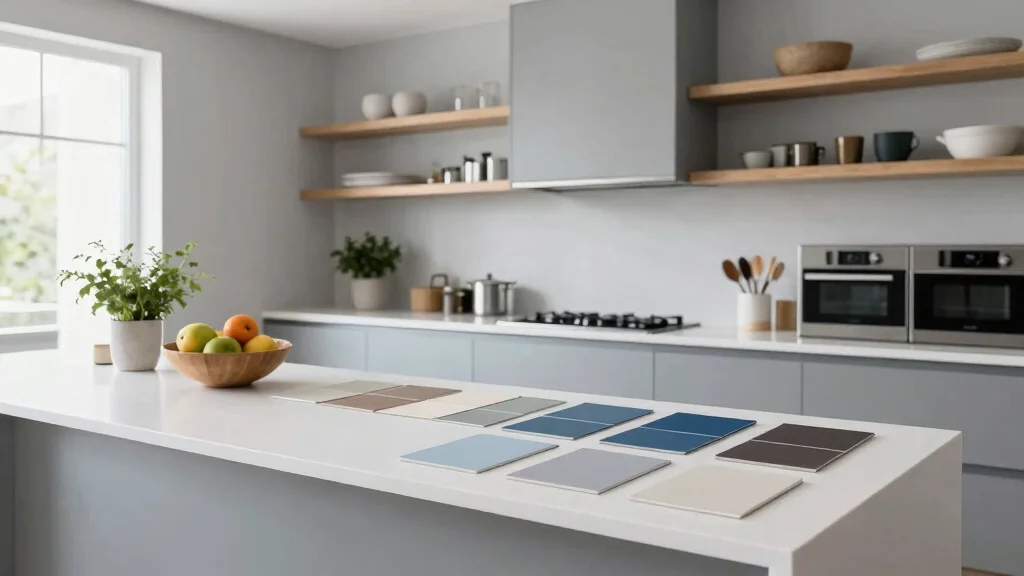
What practical steps should I take to choose kitchen paint ideas that match cabinets, countertops, and hardware?
Practical steps to choose kitchen paint ideas that match cabinets, countertops, and hardware: start by identifying undertones in stone, wood, and metal. Gather swatches that pull from those undertones and compare them under both daylight and artificial light. Create a mood board for your kitchen interior color ideas and test big swatches on a wall panel. Consider finishes—eggshell or satin hides fingerprints better in kitchens. Try a cohesive base color and reserve a second color for an accent on the island or a cabinet frame. Finally, assess durability and wipeability, ensuring your choices align with kitchen paint ideas and modern kitchen decor for a polished, lasting look.